Lumity
Redesigning a Social Learning Platform, End-to-End
Lumity is a social learning platform where users track and share what they're learning with a like-minded community. I led an end-to-end redesign to improve usability, visual consistency, and engagement, spanning research, architecture, usability testing, and design system.
Team
UX team of 4, Project Manager, Developer, CEO
What I did
UX Design · UX Research
Skills
Product Strategy · UX Design · Usability Testing · User Research · Systems Design
Tools
Figma · FigJam · UXtweak · Useberry
The Challenge
The product was fragmented. Users felt it everywhere.
There was no unified structure connecting the screens. Four specific problems made that visible.
- ·Users couldn't move between personal learning and community without losing context
- ·Screens looked and behaved differently with no shared visual language
- ·Interacting with content felt overwhelming, not inviting
- ·There was nowhere for learning, notes, and social activity to coexist
How might we
Transform Lumity into a unified, engaging platform that seamlessly connects personal learning and community experiences?
The Solution
- ·Create seamless navigation between personal, exploratory, and community spaces
- ·Establish a consistent visual and interaction system
- ·Simplify complex workflows and reduce cognitive load
- ·Encourage user engagement through clearer pathways and community features
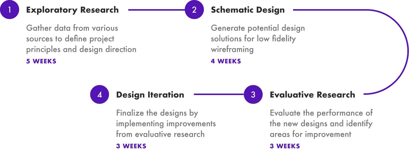
Design Approach
An end-to-end UX process across four phases over 16 weeks, combining research, testing, and design.
Six research methods. One finding that changed everything.
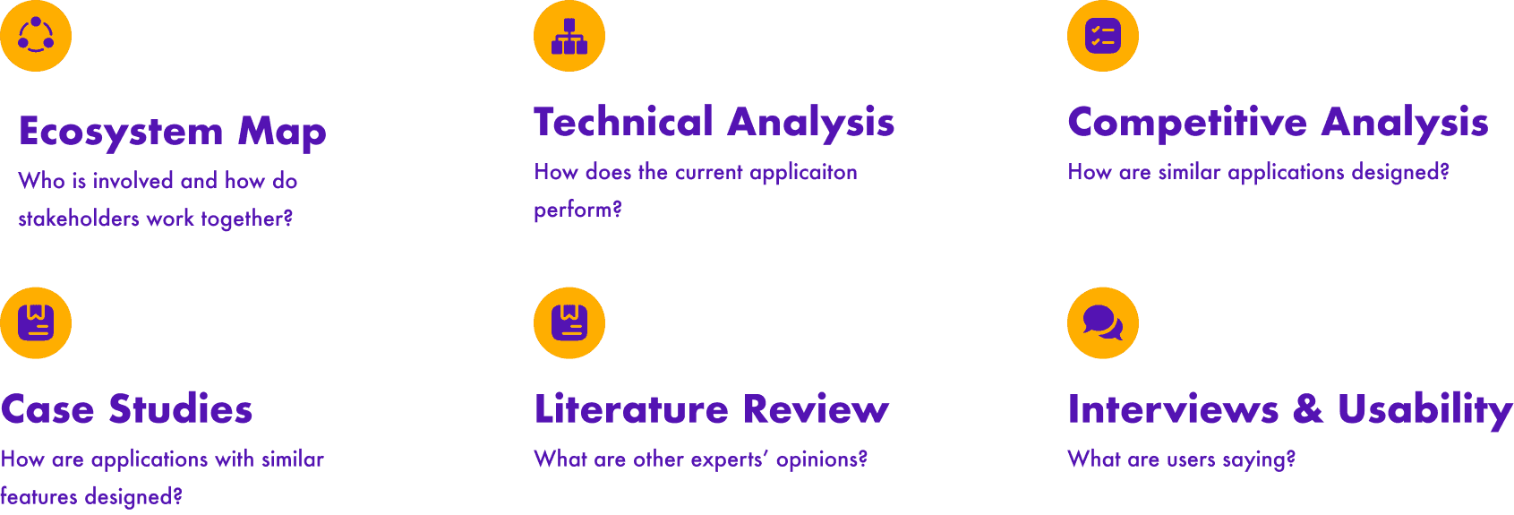
Each method surfaced something different about users and the existing product. We consolidated the findings into a table to find the pattern underneath.
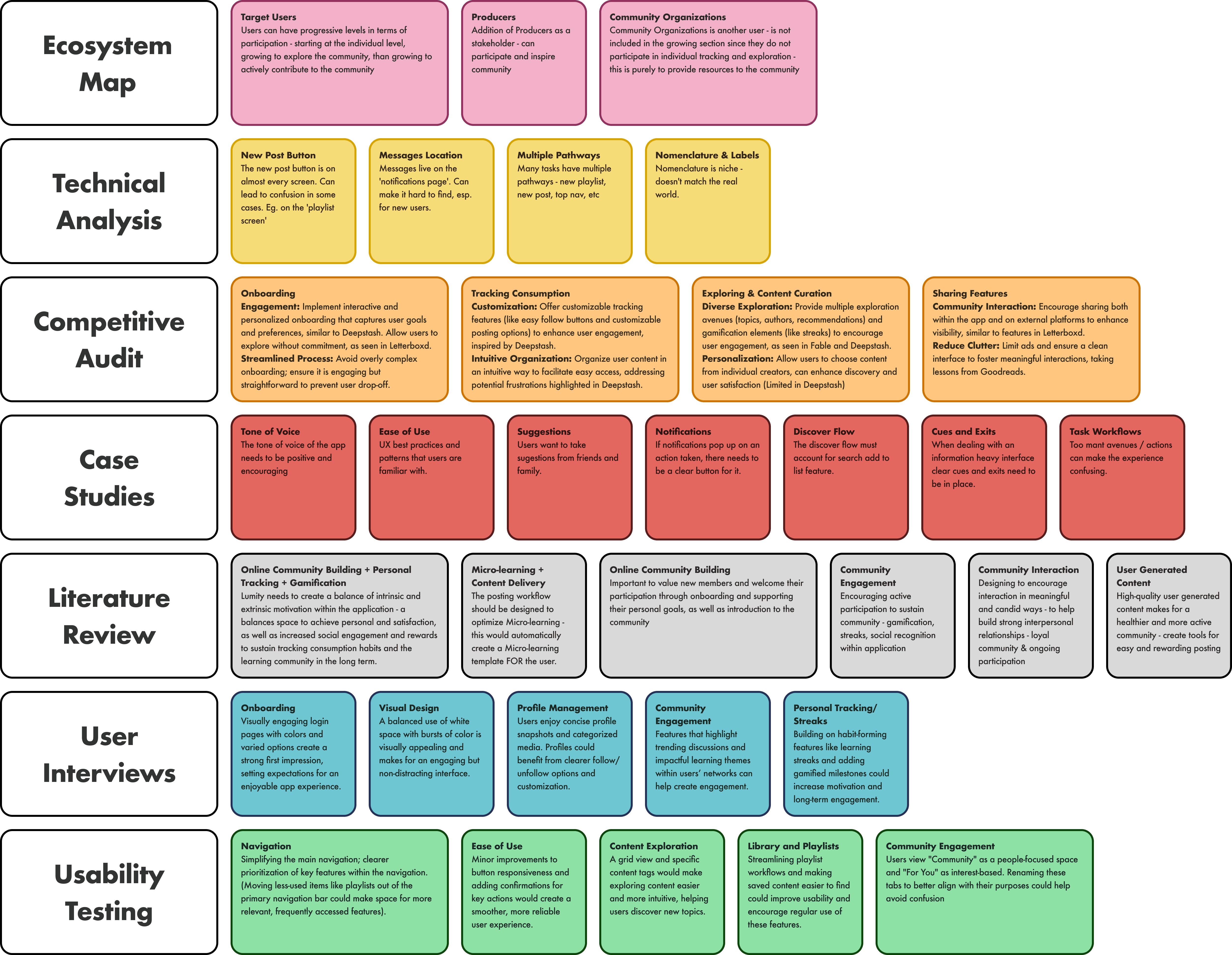
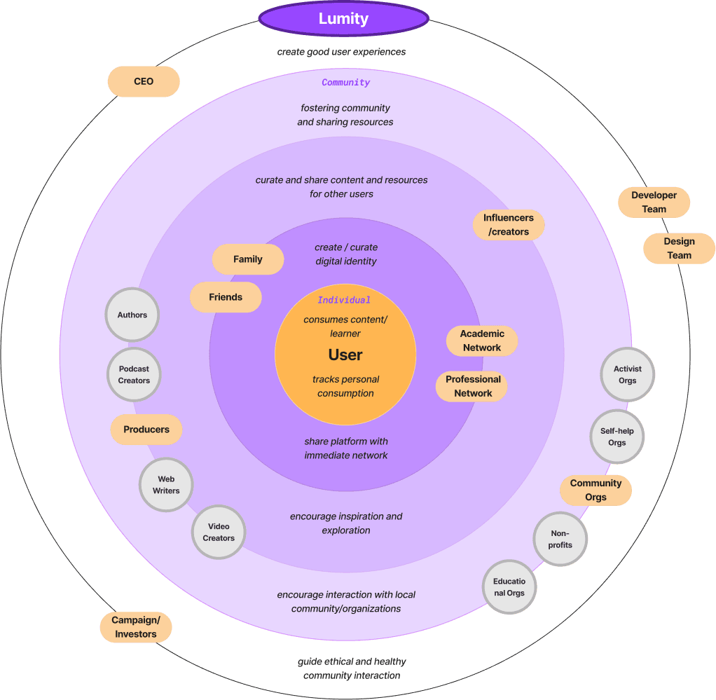
One of the most insightful takeaways came from creating the ecosystem map.
It highlighted that users exist in progressive levels: starting at the individual level, growing to explore the community, and then to actively contributing to the community.
That meant we couldn't design one experience and expect it to work for everyone.
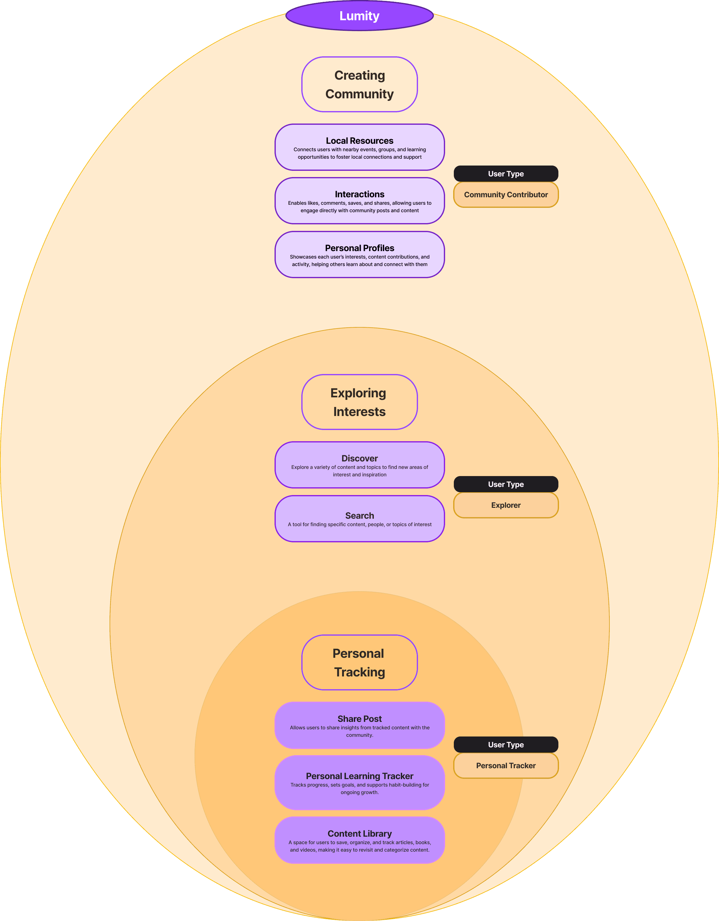
Research revealed three types of users. The app had been designed for one.
Once we understood that Lumity serves three versions of the same user, the product architecture became obvious. Three engagement levels meant three core functions.
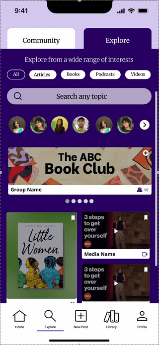
Creating Community
As users become regulars, they actively engage with others and contribute to community discussions, fostering deeper connections through the platform.
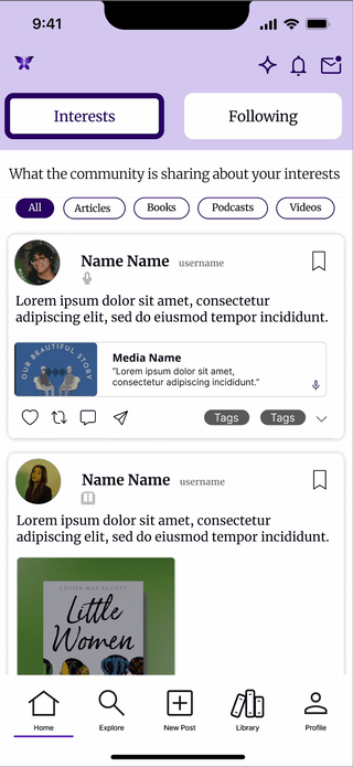
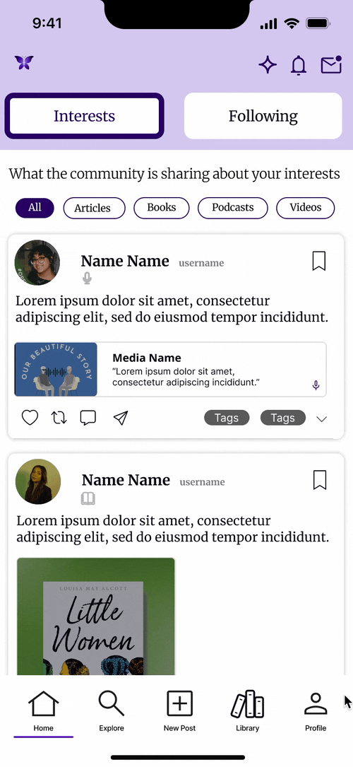
Exploring Interests
As users grow more engaged, they explore and discover new topics and search for specific content they may be interested in.
Personal Tracking
This app function supports novice users with tools for tracking progress and effectively organizing content in their Library.
Now, how do you organize all of this so the app feels simple, regardless of which user is in front of it?
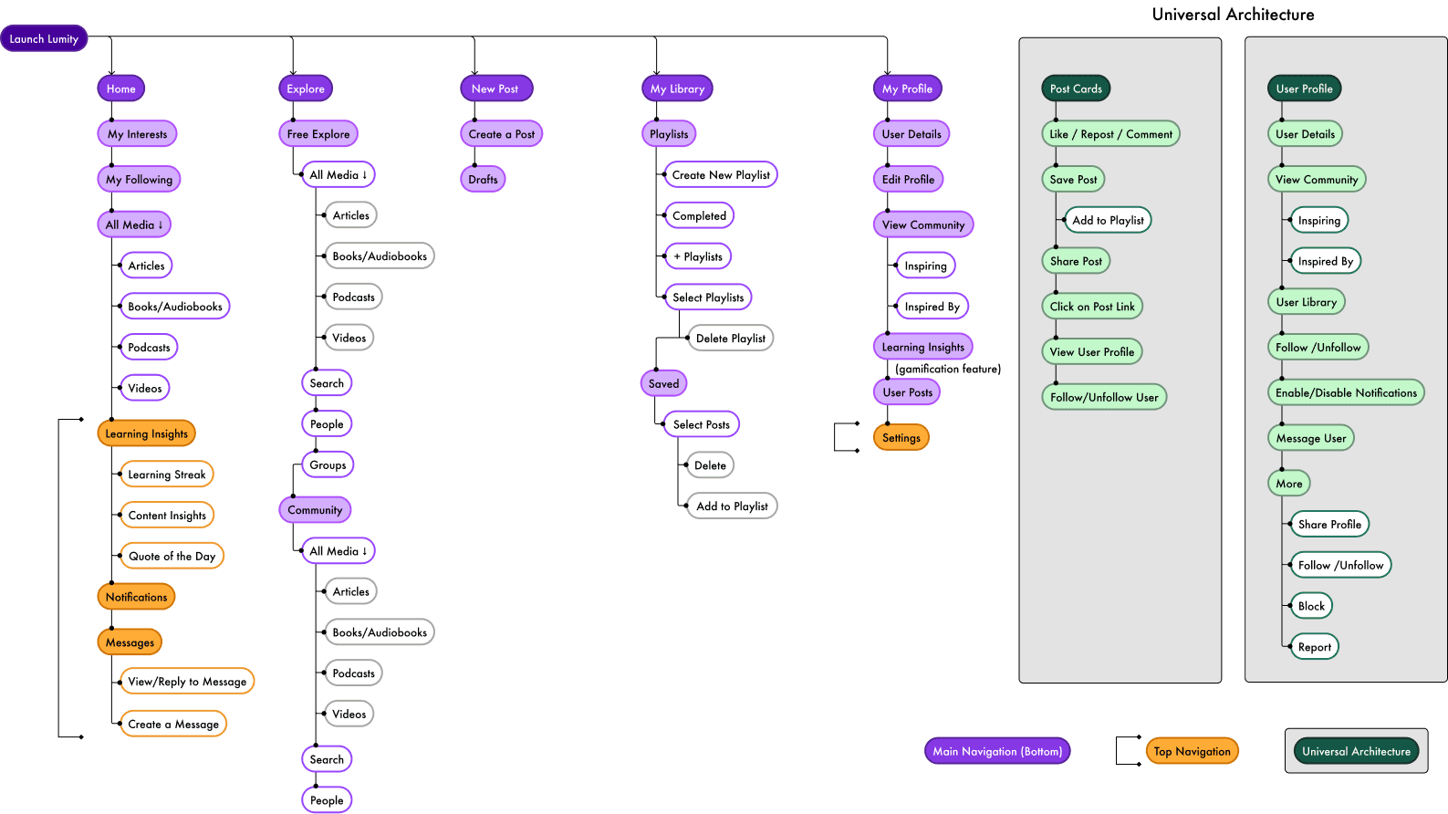
We mapped the information architecture to answer that question.
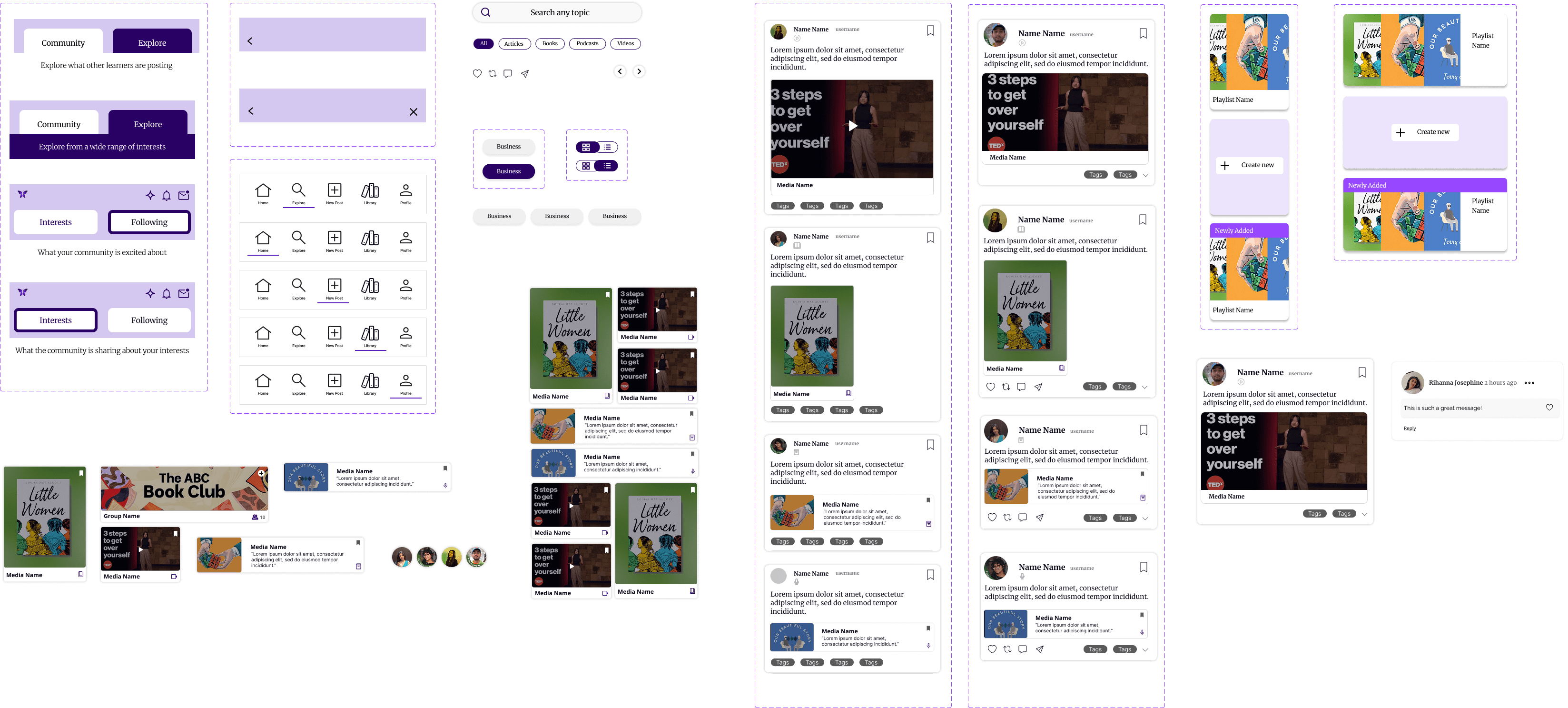
Prototyped, tested, and came out knowing exactly what to change.
Mapped key workflows, built mid-fi wireframes, and tested with four users. The goal: validate how clear the navigation and content felt in practice.
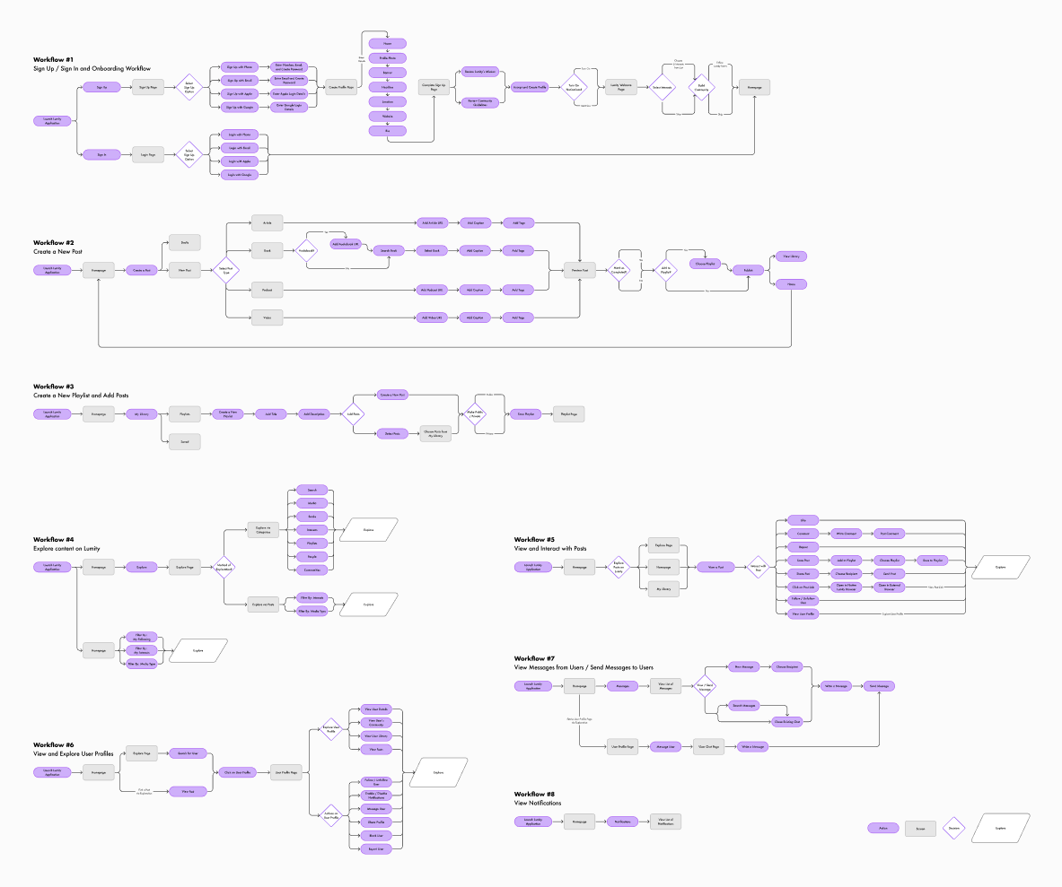
Mapping key workflows
Testing confirmed what we suspected.
01
Media types weren't distinguishable
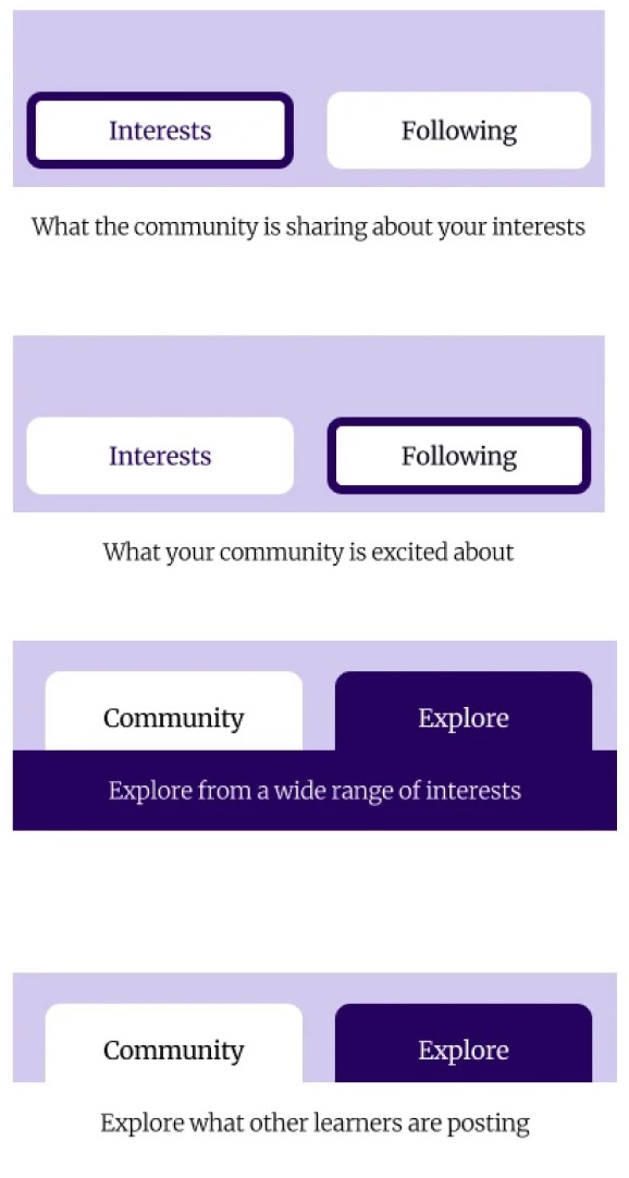
02
Navigation tabs were often missed
03
The Explore section felt too rigid
From Insights to Redesign
Issues uncovered through testing made redesign priorities clear: improve clarity, simplify navigation, and create a more engaging way to browse.
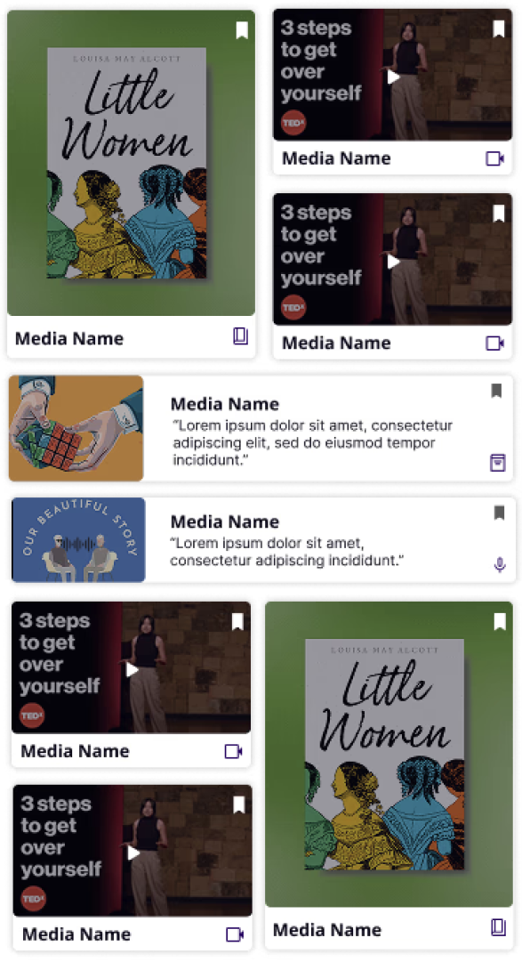
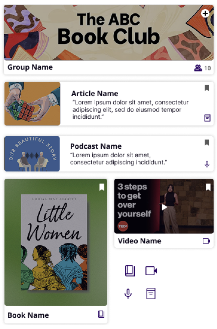
Distinct icons and shapes for each media type led to increased browsing speed and supported clearer content recognition.
Clearer labels and hierarchy of navigation tabs led to smoother wayfinding.
Dynamic grid layout of explore page boosted organic discovery and engagement.
Building Consistency
Usability fixes don't hold without a consistent system underneath.
The usability fixes addressed the surface. The design system addressed the foundation. Without consistent colors, type, and reusable components, every new screen would risk reintroducing the same inconsistencies we'd just fixed.
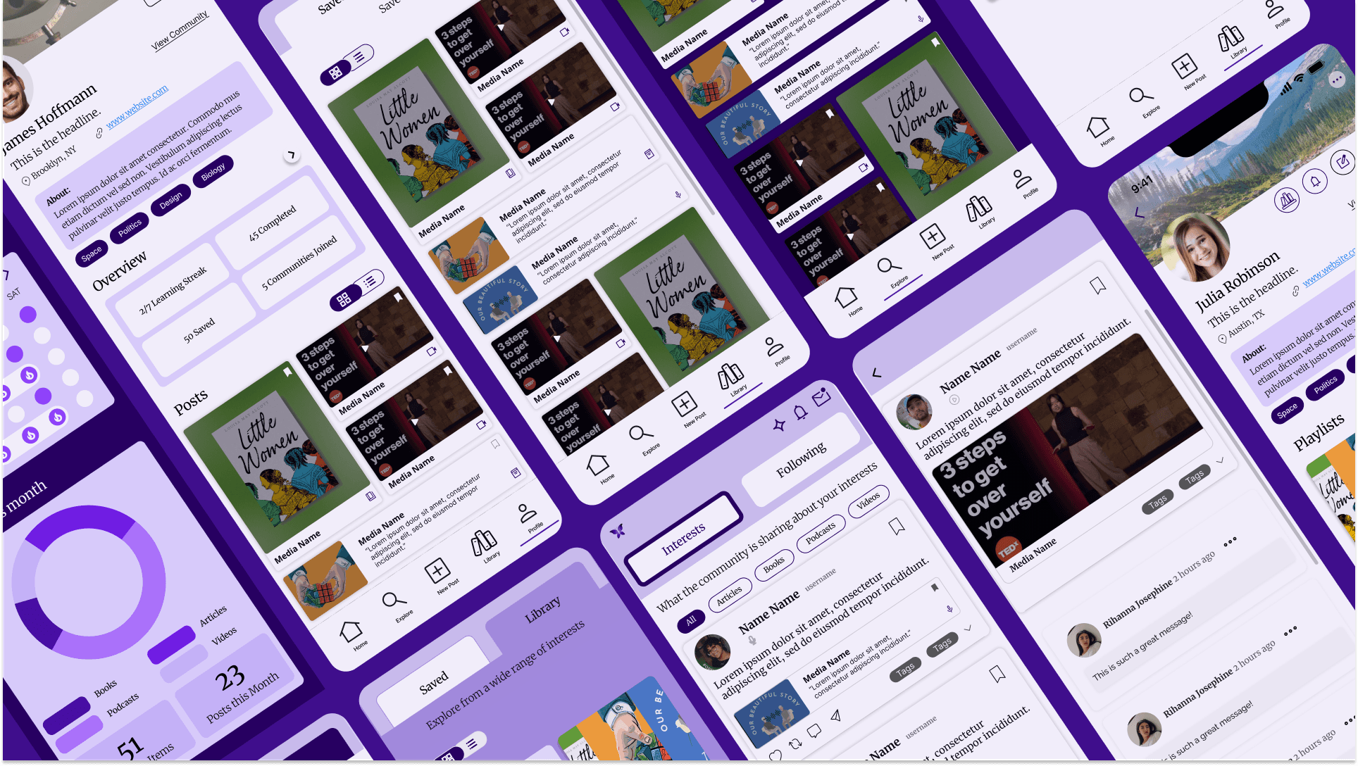
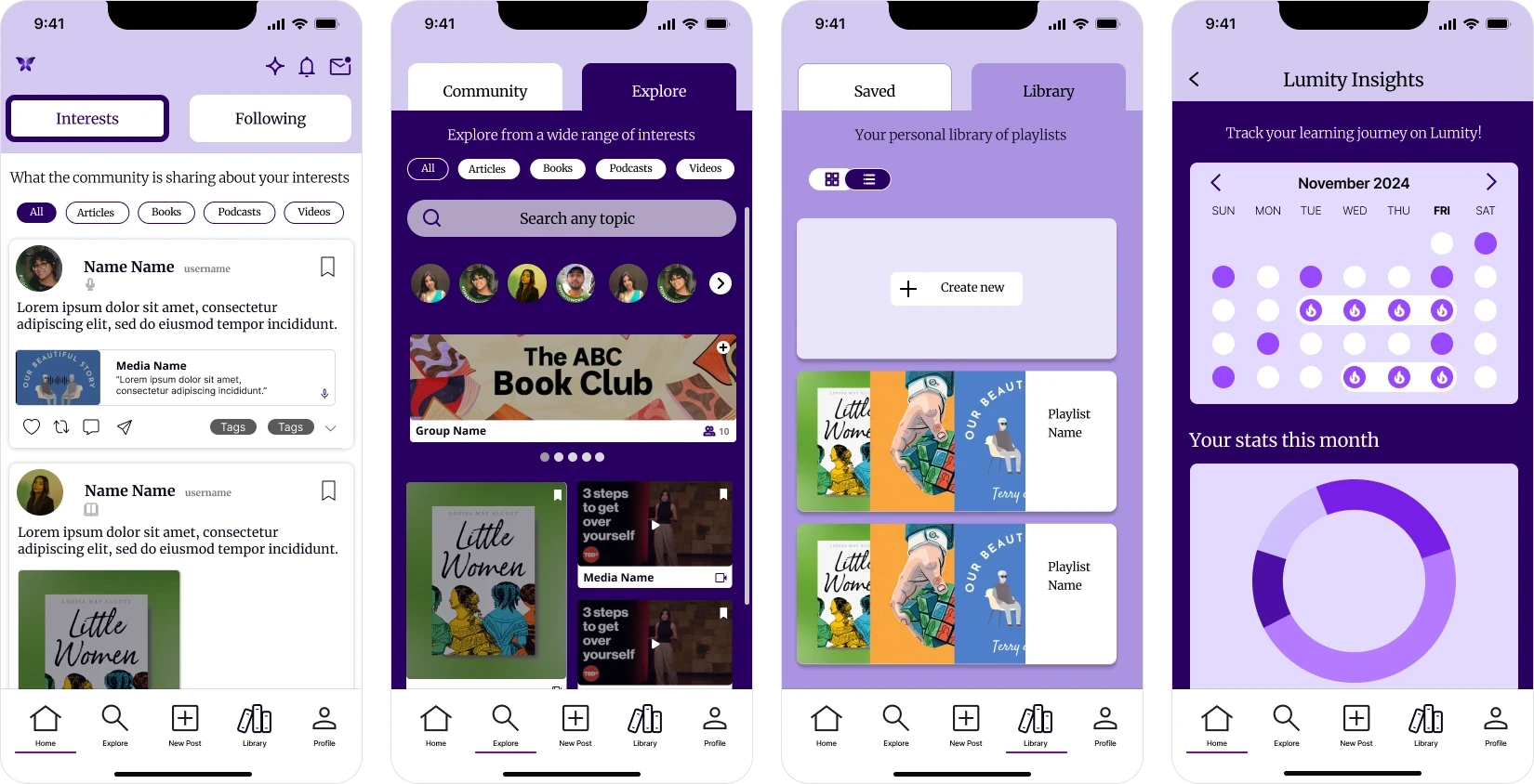
The Final Prototype
Five flows. One cohesive experience.
The final prototype brought all the redesigned pieces together. Five core workflows: onboarding, exploration, posting, library, and progress. Each working on its own and fitting together as a single coherent system.
Onboarding
Get started in seconds
Explore
Discover more, your way
Posting
Share without friction
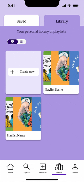
Library
Your learning, your rules
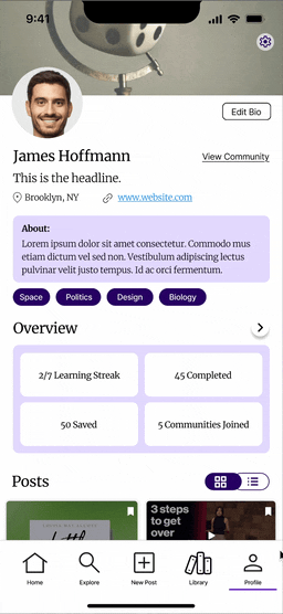
Progress
Track it. Own it. Celebrate it.
Shaping My Approach
What Lumity taught me about designing for users who aren't all the same.
For me, redesigning Lumity was a chance to apply user-centered design thinking to a consumer-facing product and see how small usability improvements can transform the overall experience.
What I learned most from this project was the value of testing early and often: small usability insights shaped some of the most impactful design changes. Building a design system also reinforced the importance of scalability, ensuring the product could grow consistently beyond the prototype.
If I had more time, my next step would be to conduct evaluative testing on the high-fidelity prototype to validate the design decisions and refine details like microinteractions and accessibility.
This project not only strengthened my skills in UX research and systems thinking, but also deepened my ability to tell a clear product story through design.