Cooper Hewitt, Smithsonian Design Museum
Reimagining Digital Art Accessibility for Screen Reader Users, Through a Multisensory Experience
Cooper Hewitt's Bungee font tester redesigned for WCAG 2.2 compliance, then extended with AI-generated audio to translate its visual richness into sound.
Team
Team of 5
What I did
Accessibility Design · Interaction Design · User Research
Skills
WCAG 2.2 · Inclusive Design · Multi-Sensory Design · Generative AI · AI Integration
Tools
Figma · Hume AI · FigJam

The Challenge
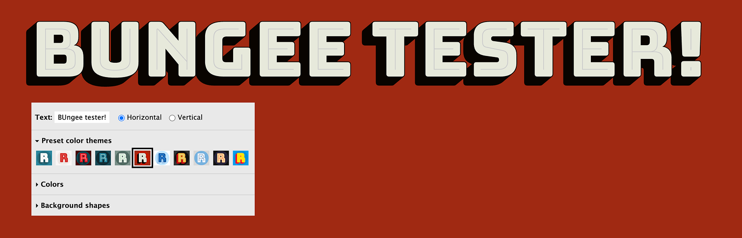
The Bungee font tester was built entirely around visual interaction.
Bungee is a chromatic display typeface by David Jonathan Ross, inspired by vintage urban signage. It layers color into letterforms, stacks them, contrasts them. Cooper Hewitt's font tester puts all of that in your hands: adjust weight, orientation, contrast, layering, and watch it respond. For visually impaired users, none of it was accessible.
So, how do people experience art, typography, and digital spaces when they can't rely on sight?
The tester had no keyboard navigation, no ARIA labels, no logical tab order. Those were fixable.
But even with those fixed, screen reader users would still only receive plain text. None of Bungee's layering, color, or personality would come through.
How might we
Ensure that Bungee's weight, color, orientation, and layering remain just as meaningful for users who rely on screen readers as they are for users who can see them?
The answer came in two parts: fix what was broken, then build something new.
Phase 01
Practical Accessibility
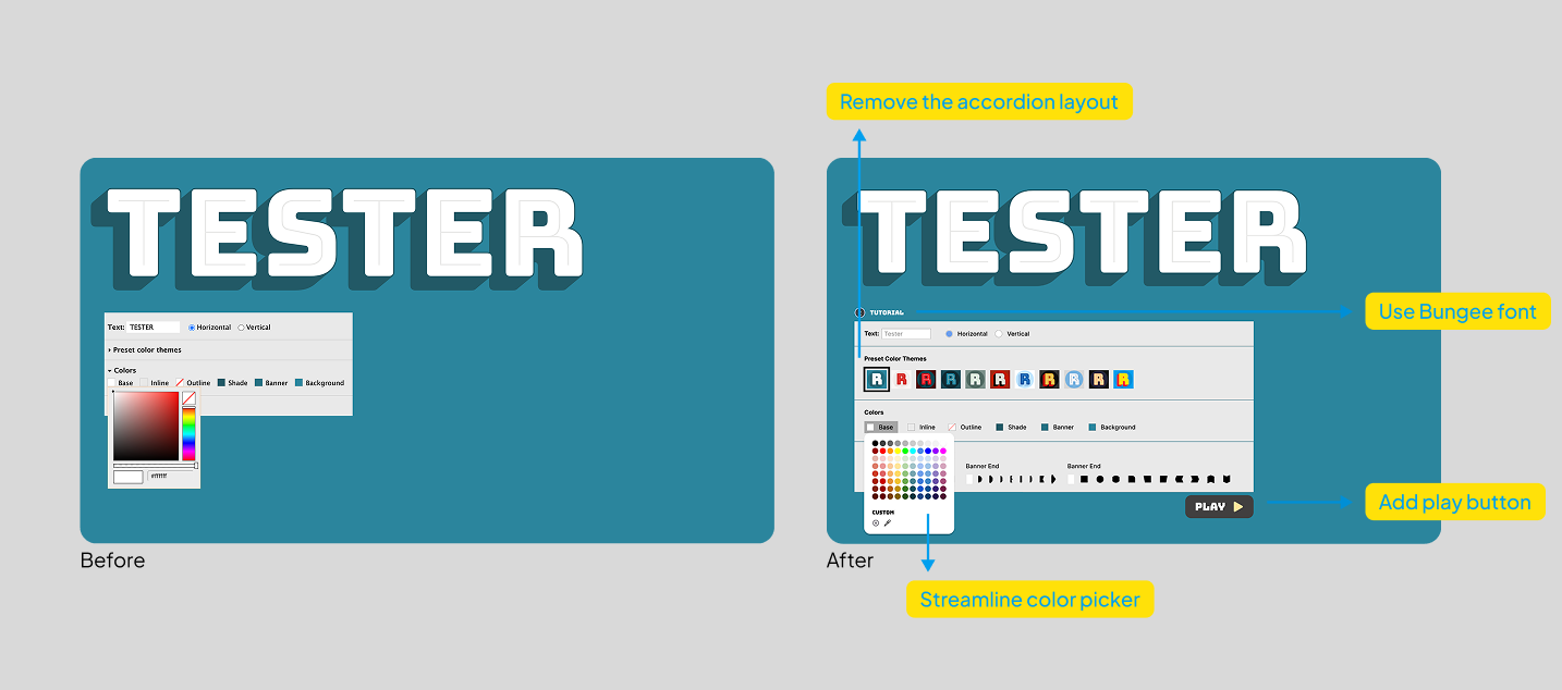
Accordion menus replaced with always-visible controls. Full keyboard navigation, logical tab order, descriptive ARIA labels, and a guided tutorial to help users navigate a non-traditional interface. WCAG 2.2 compliant.
Phase 02
Sonic Typography System
Five of Bungee's visual properties mapped to audio: contrast to voice depth, color to timbre, layering to echo and reverb, orientation to pacing, and background shapes to ambient sound. Bungee's visual personality, translated into sound.
Phase 1 was about access. Phase 2 was about expression.
Phase 1 — Practical Accessibility
Visible interface
Accordion layouts replaced with always-on controls for easier screen reader navigation.
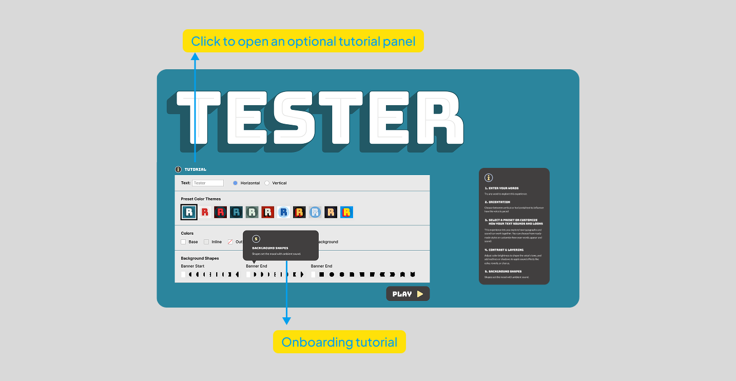
Guided tutorial
Optional onboarding helping users understand the non-traditional interface and navigate confidently.
Keyboard navigation
All controls made fully keyboard-focusable with a logical tab order throughout the tester.
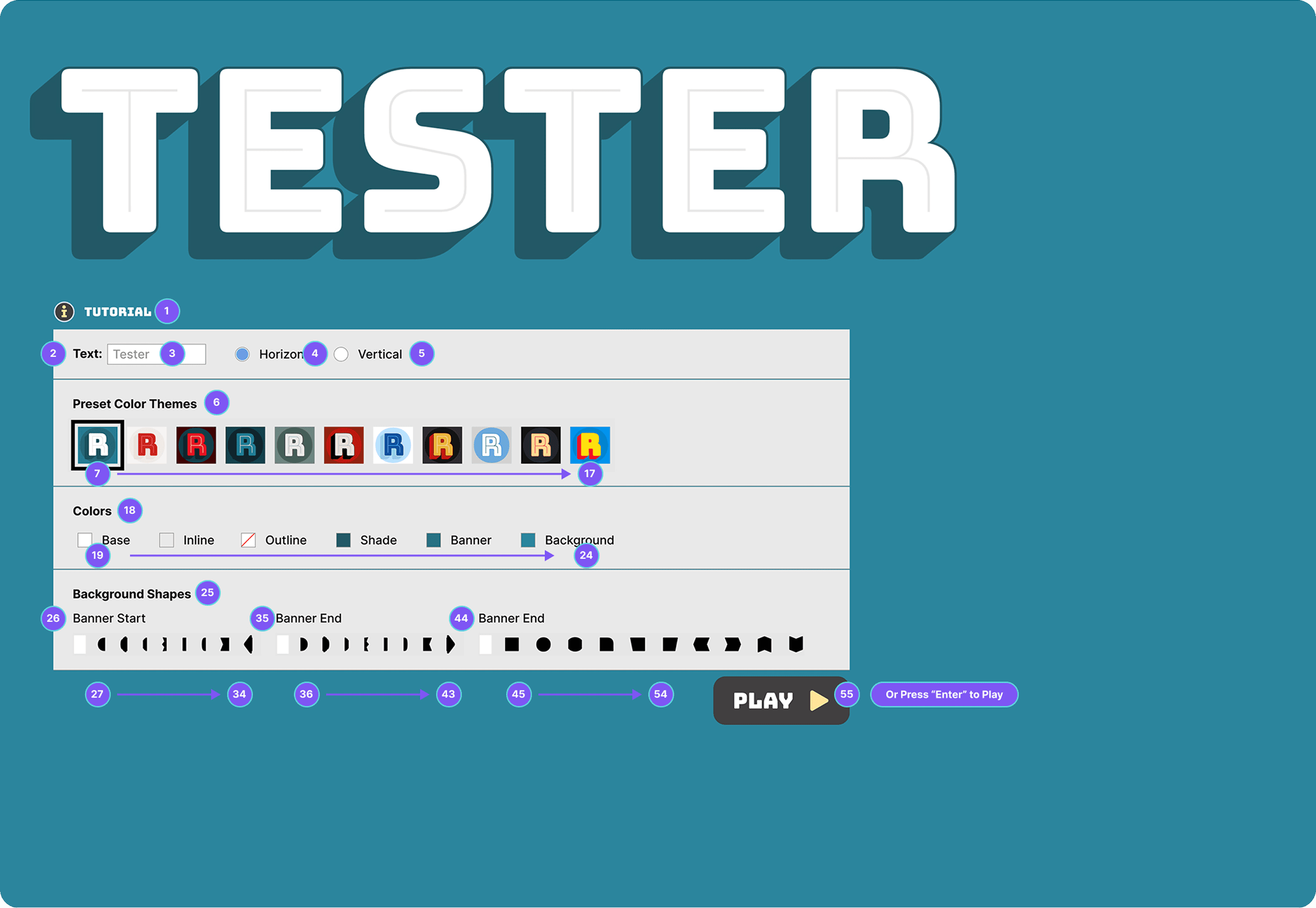
ARIA labelling
Descriptive text labels on colour swatches and controls with proper ARIA attributes for screen reader announcement.
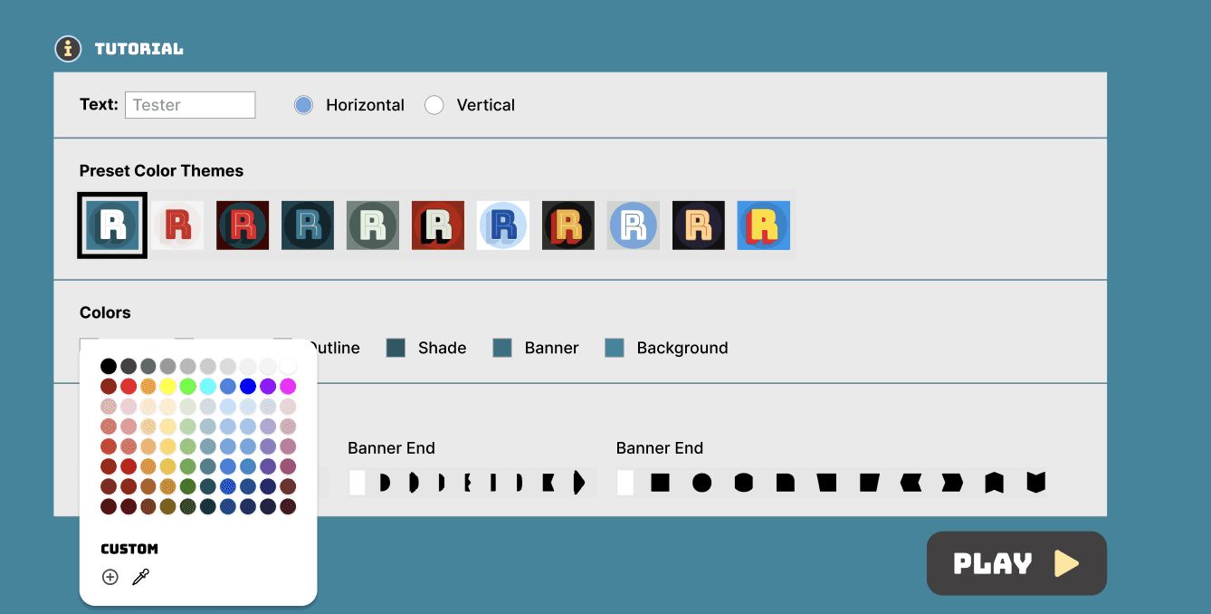
A closer look at the guided tutorial.
Because the tester uses a non-standard layout, we added an optional onboarding flow. It walks users through each control in sequence before they start, so nothing feels unfamiliar when a screen reader announces it.
Phase 2 — Sonic Typography System
Typographic sonification translates letterforms and typographic properties into sound. For Bungee, we mapped five visual properties to audio equivalents, letting the typeface's character come through even when it can't be seen.
Visual property
Audio equivalent
Internal Contrast
→
Voice Depth
Greater contrast produces deeper, more resonant voices. Lighter contrast creates higher, airier tones.
Overall Contrast
→
Timbre
Colour schemes map to voice qualities with similar emotional weight. Bright colours become energetic voices. Muted tones become softer ones.
Layering
→
Audio Effects
Inline styling adds slight echo. Outline adds reverb depth. Shade adds a chorus effect that gives the sound more body.
Orientation
→
Pacing
Vertical text becomes a distinct rhythmic pattern with deliberate pauses between letters, distinguishing it clearly from horizontal flow.
Background Shapes
→
Ambient Sound
Banner shapes produce continuous ambient tones. Block shapes create punctuated textures. Ornamental elements add subtle audio accents.
The Final Prototype
Everything working together. The tester you can see, navigate, and hear.
psst — turn sound on.
psst — turn sound on
Accessibility, to me, has shifted from a requirement to a design opportunity.
Designing for Bungee reminded me that accessibility is ultimately about creating equal access to expression. The challenge was not only to simplify navigation but also to capture the font's playful personality through sound. This balance showed me how multi-sensory design can open new ways of experiencing art and design, making it meaningful to a broader audience.
The project also highlighted how small design choices like a clearer interface, a guided tutorial, or thoughtful feedback can remove barriers for users who often get overlooked. Moving forward, I want to continue exploring how modalities like sound, touch, and motion can become integral to interaction design, and not just substitutes for vision. Accessibility has become a way to expand creativity by imagining experiences that everyone can take part in.